Bring the Outdoors Home with a Calm, Curated Gallery Wall

Today we explore gallery wall ideas for nature prints using slim, minimal frames that let botanical textures, forest hues, and soft light take center stage. You will learn how to curate, sequence, measure, and hang with confidence while honoring delicate details like leaf veins, misty horizons, and river stones. Expect practical layouts, conservation-minded materials, and approachable styling tips that create a soothing visual rhythm and a lived-in sense of wonder, inviting conversation, reflection, and gentle daily inspiration.

Shape a Cohesive Vision Before You Hang a Single Nail

Start by defining a clear visual direction that feels natural in your space, considering color temperature, subject matter, and scale so slim frames accentuate rather than compete. When the palette is restrained and the prints relate through mood or habitat, the wall reads as one considered story. This approach prevents last-minute swaps, reduces overwhelm, and helps you select frame finishes that echo wood tones, stone textures, or airy whites found in the surrounding room for graceful continuity.

Layouts That Flow Like a Trail

A successful arrangement balances order with organic energy, echoing paths, branches, and horizons. A quiet grid fosters serenity for airy plant studies, while an organic cluster suits varied sizes and energetic woodland scenes. In transitional spaces, aligning pieces along a stair slope creates a gentle ascent mirrored by the artwork’s subject matter. Keep pathways for the eye clear by repeating heights or diagonals, and use slim frames to maintain crisp edges that feel modern yet timeless.

Scale, Spacing, and Balance

The 57-Inch Sweet Spot

A common gallery guideline places artwork centers around 57 inches, roughly 145 centimeters, to align with average eye level. Use this as a reliable baseline, then adjust for furniture height or unusually tall ceilings. When frames are slim, tiny shifts feel pronounced, so measure twice and mark centers precisely. Lower slightly in living rooms where viewers are seated. This small discipline yields better harmony across multiple walls and keeps horizon lines calm, particularly in open-plan spaces.

Use Paper Templates First

Cut kraft paper to each frame size, label them, and tape them onto the wall to experiment freely. Adjust spacing and sequence until the flow feels natural from multiple angles. This saves walls from excess holes and protects delicate frames. Step back at different times of day to see how light transforms edges and pigments. When the arrangement feels inevitable, trace hardware positions directly on the paper and transfer marks, ensuring confidence and clean final results without guesswork.

Anchor with a Larger Hero

Select one larger print to serve as a calm anchor, perhaps a sweeping coastline, mature forest canopy, or expansive prairie. Surround it with smaller studies that echo textures or colors from the centerpiece. This triangular composition stabilizes the wall while slim frames maintain a coherent silhouette. Keep surrounding gaps slightly wider than internal gaps to prevent visual bulging. The result feels like a landscape with foreground, midground, and distance, guiding viewers without overtly directing every step.

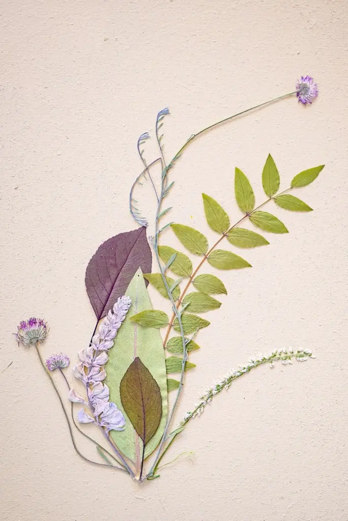
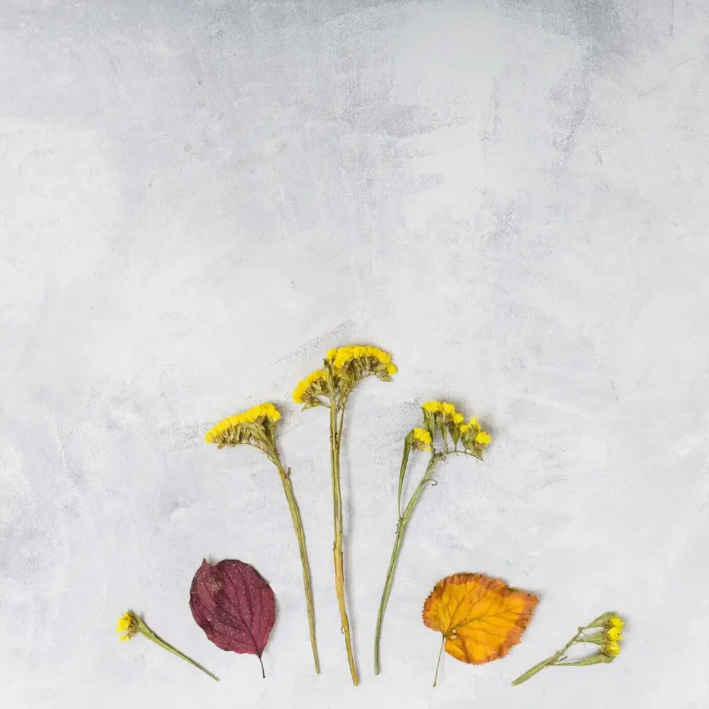
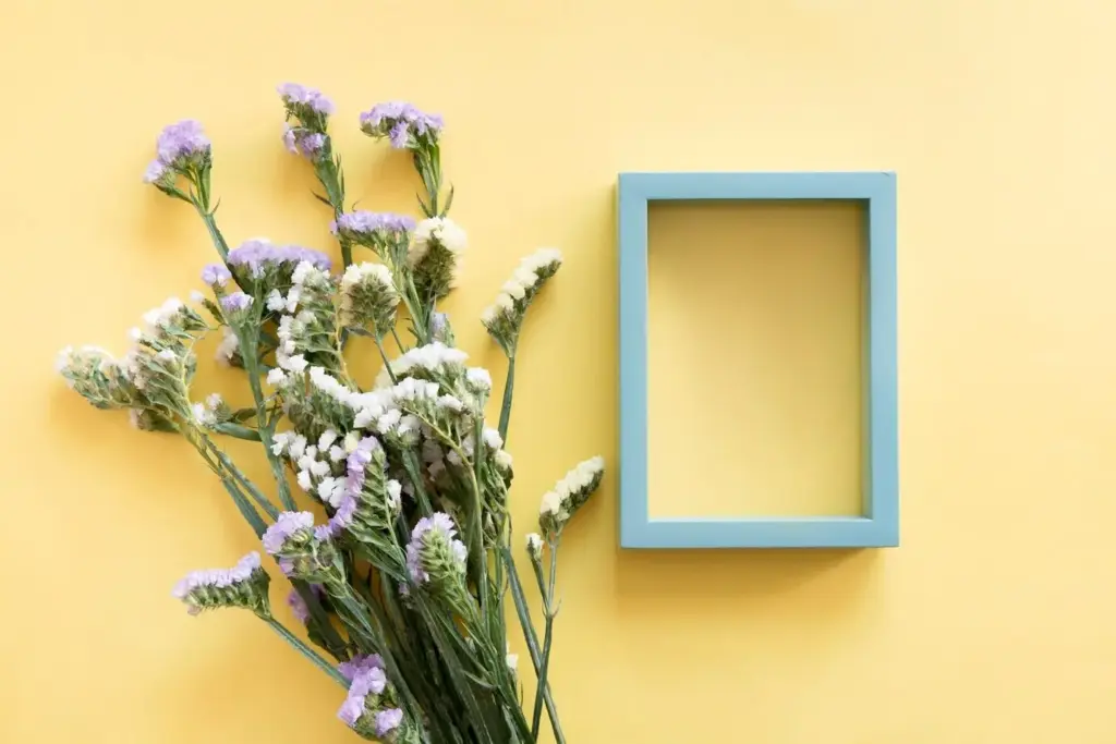
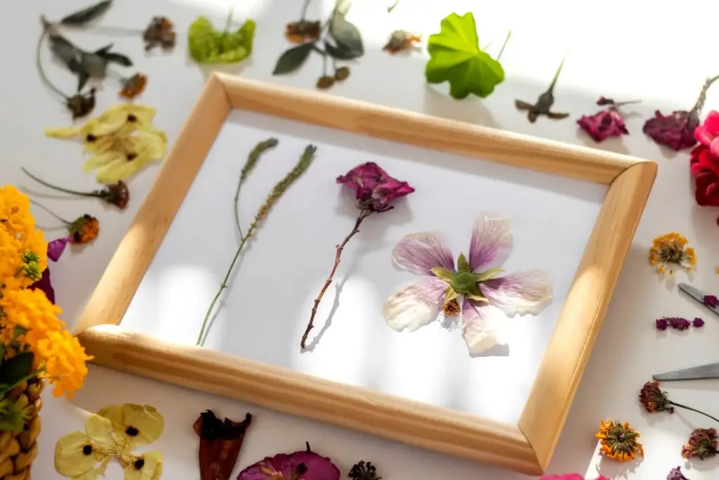
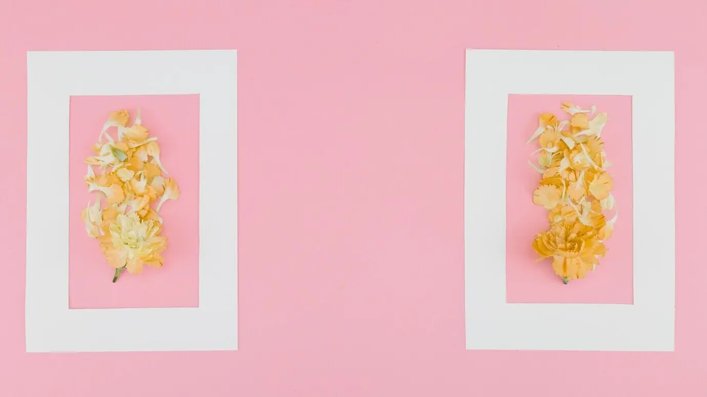
Materials and Finishes That Complement Nature

Minimal frames emphasize authenticity when materials echo outdoor elements. Matte black introduces crisp contrast, natural oak adds warmth, and brushed aluminum suggests river-worn stone. Choose conservation mats and UV-protective glazing to preserve delicate pigments. Soft, non-glare finishes reduce reflections in bright rooms, revealing gentle leaf shadows and fine grain in bark. Keep profiles thin to avoid heavy borders that compete with subject matter. The right combination makes prints feel luminous, intentional, and beautifully integrated with your furnishings.
Oak, ash, and maple harmonize with botanical palettes, adding quiet warmth without visual weight. Look for subtle grain and smooth, matte finishes that do not steal attention from watercolors or photographic textures. For consistency across multiple frames, choose a single wood species and finish, or pair a pale wood with matte black for elegant contrast. Natural oils or low-sheen lacquers keep reflections down, allowing plant structures, dew droplets, and sky gradients to glow with understated clarity.
A generous mat creates breathing room, especially with minimal frames. Two to three inches around a print lifts the imagery forward and softens transitions to wall color. Select archival, acid-free mats to protect artwork over time, and consider slightly off-white tones for warmth. A double mat can echo a key hue from your print, like sage or sand, reinforcing cohesion. Keep bevels clean and the surface matte to avoid glare that competes with delicate botanical details.

Sustainable Choices with Lasting Beauty

Nature-focused walls feel more meaningful when built with responsible materials. Choose FSC-certified woods, recycled aluminum, and archival papers sourced from reputable mills. Water-based finishes reduce fumes, while cotton or bamboo rag papers offer durability and rich texture. Sustainable choices often improve longevity, so your gallery remains vibrant without frequent replacements. Engaging with local printmakers reduces shipping footprint and deepens the story behind each piece, reminding visitors that beauty and stewardship can coexist on the same wall.

Adopt an Archival Mindset

Preserve images by combining acid-free mats, lignin-free backings, and UV-protective glazing. Use reversible hinging tapes made for conservation framing to avoid damage during future re-mounting. Keep humidity between forty and fifty-five percent to protect paper fibers. Avoid heating vents, fireplaces, or persistent sunlight. Good stewardship allows colors to stay true, from alpine blues to fern greens, ensuring your collection remains a soothing daily presence rather than a worry that fades or warps over seasons.

Source Responsibly and Locally

Look for FSC or PEFC certifications on wood frames, and seek recycled aluminum options where available. Partner with local print studios that use archival inks and responsibly sourced papers. Shorter shipping distances and minimal packaging reduce waste while building community relationships. Ask makers about their processes, from color management to trimming offcuts, so your wall reflects ethical choices. The conversation becomes part of the art, deepening meaning every time someone pauses to ask where a piece originated.

Mindful Packaging and Hanging

When unboxing, protect surfaces with soft blankets, and reuse paper corners to prevent compression marks. Handle glazing with nitrile gloves to avoid smudges. For hanging, choose hardware suited to wall type and confirmed weight ratings. Test anchors in inconspicuous areas if unsure. Conservation-friendly felt bumpers keep frames off freshly painted walls, improving air circulation. Small, steady habits preserve both the room and the work, letting prints age gracefully without unnecessary maintenance or preventable accidents.

Choose the Right Hardware

D-rings and braided wire distribute weight evenly and keep frames close to the wall, which is especially important with slim profiles. For drywall, use appropriate anchors; for masonry, consider sleeve anchors or masonry screws. Check weight ratings carefully and avoid over-tightening to preserve delicate corners. Use two hooks to prevent shifting and maintain level lines. With reliable hardware, you can enjoy tranquil compositions without worrying about gradual slippage or sudden, avoidable mishaps.

Level Once, Double-Check Twice

Even tiny misalignments appear glaring when frames are minimal. Use a bubble or laser level and mark lightly with removable tape before committing. Step back frequently, viewing from different seats and heights. Adjust for optical illusions created by crown molding or slanted ceilings. Take your time during this stage; the patience invested now ensures your final arrangement feels calm, precise, and effortlessly balanced, allowing botanical textures and horizon lines to guide the eye without interruption.

Ongoing Care and Light Management

Dust frames and glazing with a microfiber cloth every few weeks, and rotate prints every few months if direct light is unavoidable. Consider installing sheer curtains to soften midday brightness without losing the uplifting quality of natural daylight. Check wire tension seasonally to prevent sagging. Tiny, consistent habits protect color fidelity and paper integrity, keeping foggy lakes, alpine meadows, and intricate fern patterns vibrant. Care is part of the experience, extending the life of your tranquil arrangement.

Evolving the Wall and Inviting Conversation

A nature-focused arrangement can grow with you. Swap in seasonal imagery, expand to adjacent walls, or introduce a new finish sparingly to refresh without chaos. Invite friends and family to share favorite trails or coastlines that inspire additions. Encourage feedback, questions, and stories so the wall becomes a living archive of experiences. If you enjoy ongoing guidance, subscribe for occasional tips, layout sketches, and conservation insights that help your collection mature gracefully while retaining its serene, minimalist charm.
Vunekifaranopilexaleku
Privacy Overview

This website uses cookies so that we can provide you with the best user experience possible. Cookie information is stored in your browser and performs functions such as recognising you when you return to our website and helping our team to understand which sections of the website you find most interesting and useful.